Ideas on colour:
Beginning posts will explore
theoretical aspects, which I find essential for in-depth analysis or
description of art. I wholeheartedly believe that to fully understand something
one has to discover how did the enjoyed thing was made, its material, colour,
the way that the light falls, then the period in which it was created and its
history, so that finally one can say that he/she knows, understands, adores, or
finds this particular thing inspiring. I tend to think that it is not possible
to be inspired by an object without knowing what the object represents, who it
was made by or why it was made. It might be an old fashioned approach, which is
more time consuming, but again I prefer to know less if the knowledge I possess
is of a good quality. Lately I was drawn into theories on colour. Colour is an
essential and vital element of art, performance, even music. There are several
fragments of texts from various artists I would like to share with you. Firstly
in this essay, I will analyse my favourite excerpt from a letter of Vincent van
Gogh to his brother Theo:
“[…] Absolute black does
not really occur. But like white, it is present in almost all colours, and
forms the endless variety of greys- distinguished in tone and intensity- so
that in nature one really does not see anything but tones and intensities[…] By
adding black and some white one gets the endless variation of greys, red-grey,
yellow-grey, blue-grey, green-grey, orange-grey, violet-grey....”
Most of all I enjoy artists'
views on colour or form as they have a background in working with the medium,
they feel most delicate differences in the tones and shades, here we have a
view on the idea of lack of purity in colour, every shade in van Gogh's opinion
has a certain amount of grey in it, which creates a world of grey shades
varying on warmth or cool, shade and intensity. As if for van Gogh everything
begins from black or white mixed in various variations. Black for him is
present but never definitely on its own, never an absolute black. This opens a
pallet of colours, no longer just yellow, blue, violet, he offers a different
perspective, which requires nature of explorer as one to see what van Gogh is
writing about has to learn to look, has to teach one's eyes to see those
delicate at times, less obvious differences. Vincent's works has a lot of this
to offer he beautifully operates with colours, similar shades delicately
mingling in the thickly applied paint.
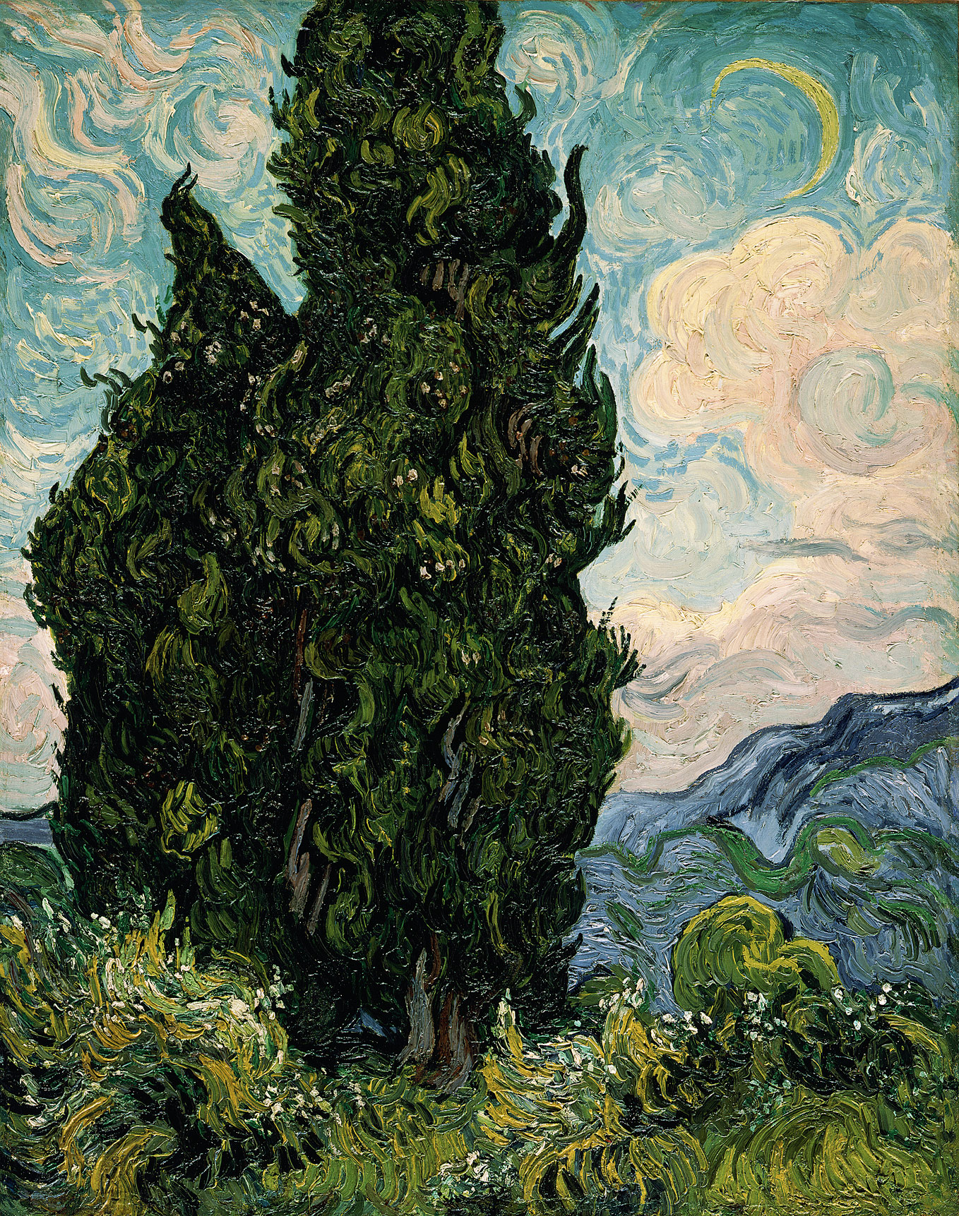
Cypresses, 1889
Vincent van Gogh (Dutch, 1853–1890)
Oil on canvas; 36 3/4 x 29 1/8 in. (93.4 x 74 cm)
Rogers Fund, 1949 (49.30)
In Cypresses,
the idea expressed by Vincent is beautifully visible, cool shades of blues and
greens, delicately joined by warmth, which is hardly noticeable. He refers to
the cypresses as a 'dark patch' and this dark patch for him is a colour as if
this aspect in the process of painting was more interesting for him. His
sensitivity to colour was exquisite, we can see colours from close signifying nothing but patches
or thick bulbs of paint, from distance they move, vibrate, as if planning to
leave the canvas, or to imitate the move of the leaves and grass accompanied by
a delicate blows of wind. Van Gogh is like classical music, always alive, complicated,
emotional and colourful, to cherish his art one has to see his works live and
once seeing them to spend a longer moment in analysing thickly placed paint and
to move together with his work, once closer once a bit more distant, only then
the power of colour and form will show its secrets to the viewer. And once it
happens it is an emotional and moving experience, and then one can say 'I have
seen van Gogh and I understood him'.
Another interesting point to
make is the approach of van Gogh's contemporaries to the idea of 'primary'
colour, in Colour and Meaning:
Art, Science, and Symbolism John Gage
(p.31) states:
"...it was one of the
important achievements of the experimental psychology of van Gogh's time to
have shown that a love of strong, saturated 'primary' colours was not the
preserve of primitives or of children, but was also common among educated
European adults[...]"
Twentieth-century directed
artists towards strong, vibrant colours. One can think of Impressionists, and
then Gauguin, Munch, Cezanne, and then followed by Picasso, Dali, Rousseau,
Matisse, Kandinsky, Bonnard, Hopper, Kahlo and many others. Those great
painters were using colour as a tool to express culture, like did Gauguin or
Kahlo. A tool to express form like did Miro and Picasso, and a tool to express
imagination like did Dali and Kandinsk.
Self-portrait with Thorn Necklace and
Hummingbird, 1940
Frida Kahlo, Nickolas Muray Collection,
Harry Ransom Center, University of Texas at Austin
The Smile of the Flamboyant Wings, 1953
Joan Miró
Considering colour on so many levels gives it strength, which
has to be included in the interpretation of the painting and expands
interpretation to deeper layers. Gage makes an interesting point on colour:
“It was these
psychological as well as technological developments that lay behind what has
always been recognized as the enormously expanded interest in high contrasting
hues that marks the visual expression of twentieth-century Western culture, and
which has sometimes been characterized, rather misleadingly, as the
emancipation of colour in the modern world.”
Colour was always an important
tool of art, in Ancient Greece all stature and highly ranked buildings were
encrusted with gems and painted in vibrant reds and blues. In Medieval era,
Churches were filled with colours so that those who could not read were able to
experience the significance of their faith. In Renaissance colours were far
more delicate, but still spoke to those who wanted to experience art, as were
hiding various symbols. Baroque offered more vibrant shades as was all about
splendour and excess. Each period had to offer different approach to art so
that it was distinguished from the preceding period, Twentieth-century was no
different in that matter, it was different from previous and opened space for
the future developments in art. And theory of colour is one of the factors
which changed together with the trends. I shall write more on the ideas behind
of the importance of colour form perspectives of other painters and theorists
and on its symbolism which is fascinating. But for now I shall leave you with
some points made by use of Vincent van Gogh's ideas. I am interested what other
people think of him as a painter, so feel free to share with me your beautiful
thoughts.


.jpg/200px-Frida_Kahlo_(self_portrait).jpg)
